Behind every great photo, is a really good story. With our #WinAPrintConest well underway, we wanted to take you behind the scenes of each of the Nigel Barker prints our grand prize winner has a chance to win. Read on for our latest interview with Nigel, where he takes us a bit deeper behind each of his photos.
Explain the inspiration behind each of these prints.
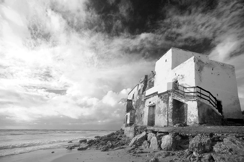
Beach Ruin: There’s perhaps nothing more romantic than living right on the ocean, and this shot of an ancient Ryad in Essaouira, Morocco epitomizes that notion with an endless horizon, whipping Mistral winds and a burning Sahara Sun.
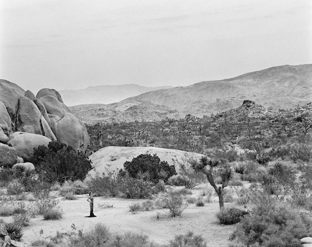
Desolate Beauty: Joshua Tree National Park is one of my favorite locations because of the peculiar Dr. Seuss-like Joshua Tree Cacti popping out of the desert landscape. Placing a just-as-out-of-place willowy model dressed in a full-length couture gown helped create my own wacky reality/fantasy and begs the question - why?
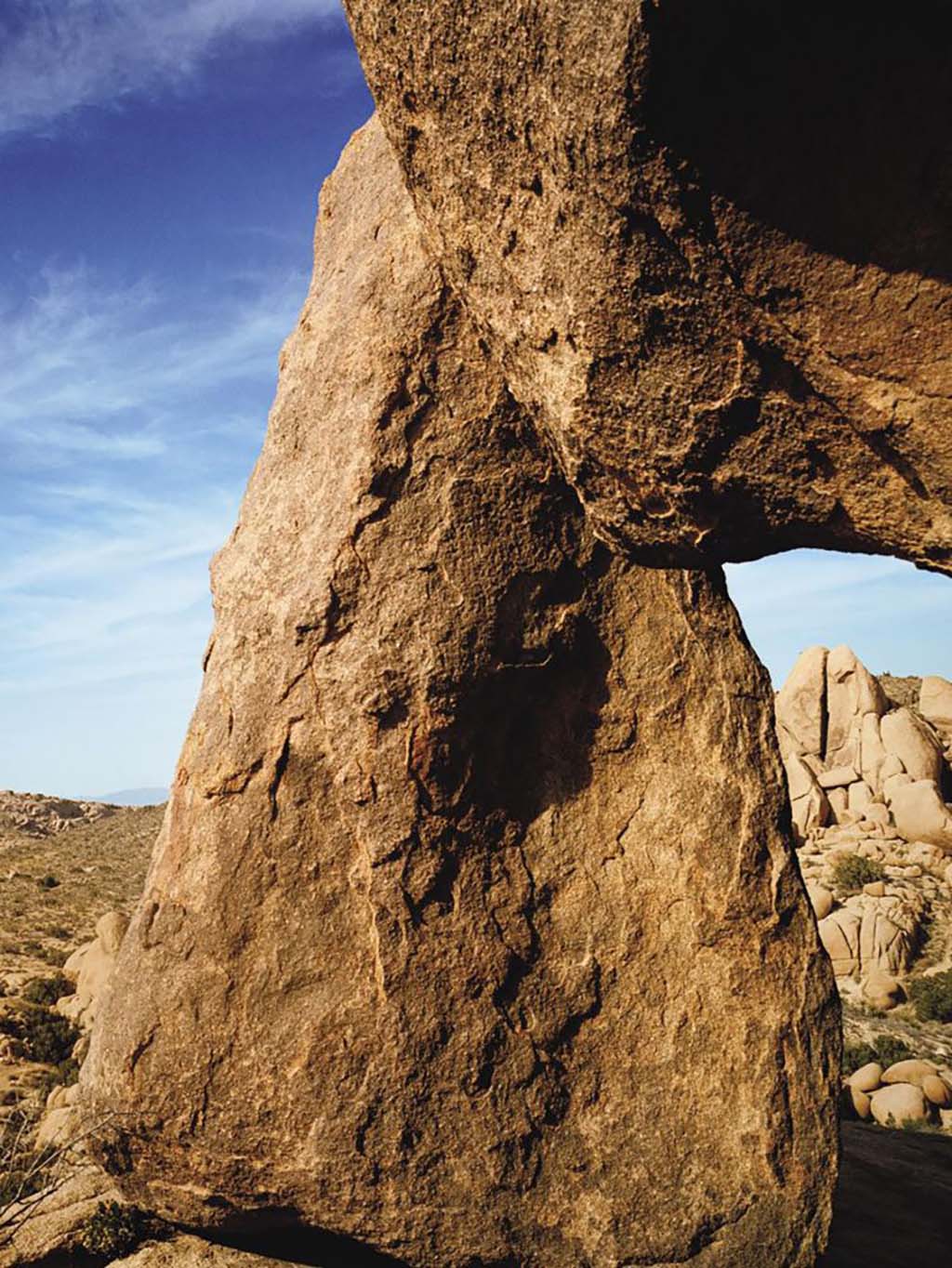
Escape: In a landscape full of drama, a rocky vista filled with boulders and obelisks, it’s normal for one to look at the big picture but when you go in tight and concentrate on the details, there seem to be worlds within worlds.

Why did you choose black and white for two of the images?
Certainly, some images lend themselves to black and white more so than others because of the high contrast and tones, but I also like how black and white helps you focus on the subtleties in the image. By choosing black and white, certain elements in the picture don’t have to struggle to stand out and compete with all the various shades of color.
Also, black and white somehow gives photos a timeless, iconic feel and helps make the imagery otherworldly.
How do prints enhance the tone and feel of each image?
The word “photograph” comes from the Greek meaning “drawing with light” and in my opinion, the process of printing your digital file literally brings your image to life by adding texture, depth, and dimension. I especially like large format prints which allow your eye to travel around the image and give the photo room to breathe and space for the story to unfold.

Each of these shots shares a very earthy, geological tone. Could you explain how natural elements help shape the composition of each frame?
Earth, wind, and fire quite literally always make for solid subject matter. Rocks, desert, and plain old dirt have a history built into every facet and tells the story of time with very little effort. In my shot, Beach Ruin, the wind whipping off the ocean, sandblasting the old building with the hot sun following suit reminds you that eventually, everything turns to dust.
In Desolate Beauty, it’s the juxtaposition of high fashion to a grand desert vista. The story of something so quintessentially human sprouting out of a world so natural, yet somehow it fits in very well and isn’t even as unusual as the Joshua Trees themselves.
Finally in Escape, the triangular-shaped boulder almost looks carved like a giant axe head. The definition of the rock and the layers of sediment tiled one upon the other allow you to sit and stare at this image while your imagination creates a story for every crack and fissure.

Can you share any fun BTS secrets from any of these shoots?
Beach Ruin was taken while location scouting for a shoot on America’s Next Top Model Cycle 16. Although the ancient Ryad never made it into any of shots on the show, it made for an exotic backdrop to shoot the episode and I didn’t want such a gem to go to waste so I photographed it for my own archive and perhaps your wall!
Desolate Beauty is taken from a fashion story I shot for Cover Magazine. Normally fashion stories have a shelf life because the image is about the clothes and the trends, but due to the scale of this shot, it has stood the test of time. What you can’t tell is that it was 105 degrees and we were all melting in the desert heat. I had gone to look for another location over a ridge and returned to see the model standing in this expanse looking for me and I captured this shot.
Escape was taken on our honeymoon 20 years ago, but it looks like it could have been taken yesterday! Funny story from that day is that I lost the car keys when returning to the car but luckily hadn’t locked the doors and was able to turn the headlights on and found the keys in the beam of light right outside the car. The whole process took over an hour during which we thought we would be spending the night under the desert stars.
Any tips on what prints look best in your home and why?
I have designed entire rooms around a photo print. The main living area in my home, which includes my kitchen, dining area, and living room is very monochromatic with shades of white and earth tones. All the images I have framed are black and white, and include a large format print of the horizon over the ocean that I shot while at my sister-in-law’s wedding in Jamaica. The photos are simple and beautiful in their own right, but those of us who were there and know the photo understand the extra special significance of the time when it was shot.
The entrance hall to my house has photos of bands and musicians, giving everyone a rock and roll welcome when they arrive. Our bedroom has life-size shots of my wife when she was pregnant with our children and life-size shots of my my children when they were babies. As it’s our bedroom, these personal types of imagery work well and make me happy every time I see those precious moments. In our master bathroom I have a shot of the frozen tundra in the Arctic that I used the same color scheme from to paint the walls, and I even wrapped our trash can in the same image to bring the photo from one side of the room to the other.
Essentially, photos are one of the best, most personal and cost-effective ways of decorating your home. They don’t just inject color and scenery into the room, but they act as windows or portals into the memories that make you happy and dream.
What are some of your favorite contestant submissions so far?
I am loving the submissions, especially the ones that take me to places I have not been to yet. We have had amazing aerial shots, giving us a literal birds-eye view of familiar locations like beaches and cities, which from that angle look completely different. I also have been particularly taken by the street photography that captures the spirit and essence of everyday life and how cool the simplest moments can be. I know that many of these photos will be just as appealing in twenty years as they are now, if not more so.
About the Mimeo Photos Win a Print Contest
Want to participate in our free contest? Click here to learn more about our #WinAPrintContest and how to enter.
